Editor
The PowerPop Editor is a drag-and-drop tool where you visually design and customize your popup, adjust styles, set behaviors, and preview how it appears on different devices.
Choose a Template
After creating the campaign, you’ll be taken to a screen where you can choose from a variety of ready-made templates. These templates serve as your starting point for designing the popup.
To make your search easier, use the Select template group dropdown to filter templates based on the type of popup you want to build (e.g. discount, newsletter signup, exit intent).
Once you find a template you like, click on it to select it. This will automatically generate your campaign based on that design.

Open the Editor
After the campaign is created, you’ll see it listed in your campaigns dashboard. Click the brush icon next to your campaign to enter the Editor.

Start Customizing
You’ll now be inside the PowerPop Editor - this is where you can fully design and customize your popup using drag-and-drop tools, styling panels, and live preview.

PowerPop Editor – Tool Overview
Center Canvas Area
"Drop a block here" –This is where you build your popup. You can drag and drop blocks (like text, images, buttons) from the right panel into this area to start designing.

Device Icons (Desktop, Tablet & Mobile)
Switch views to see how your popup looks on different devices.

Dotted Outline Button
Toggles the outline view so you can better visualize element boundaries.

Zoom Out
Allows you to adjust the view scale of your popup while editing. This helps you design more precisely and preview how your popup looks at different browser sizes or zoom levels.

Main Popup / Sticker Tabs
Switch between editing your popup or sticker (if applicable).
Upper Right Tab Icons
- Save Campaign (top right) – Saves all the changes you’ve made to your campaign.

- Save as Draft – Use this if you're not done yet. It saves your popup but doesn’t show it on your website.

- Save and Publish – Use this when your popup is ready. It saves and shows the popup to your website visitors.

- Save and Enable Preview – Use this if you want to test the popup first. It saves it and lets only you see it on the site.

- Exit Without Saving – Use this if you don’t want to keep any changes. It closes the editor and discards everything you changed.

- Undo & Redo – Lets you quickly undo or redo your most recent actions while editing.

Right Sidebar – Block Library
This is where you’ll find all the elements you can drag into the canvas. They’re grouped into categories:

Rows Section in PowerPop Editor
The Rows section lets you control how your popup layout is divided into horizontal sections. Rows help you organize your content — for example, you can have text in one row and an image or button in another.

Contents Section Overview
The Contents section in the PowerPop Editor allows you to add and arrange different elements inside your popup. Each element serves a specific purpose, helping you design engaging and interactive popups that match your campaign goals.
Here’s what each content type does:
Image
Add an image to make your popup more attractive. You can upload a product photo, logo, or any visual that fits your campaign design.
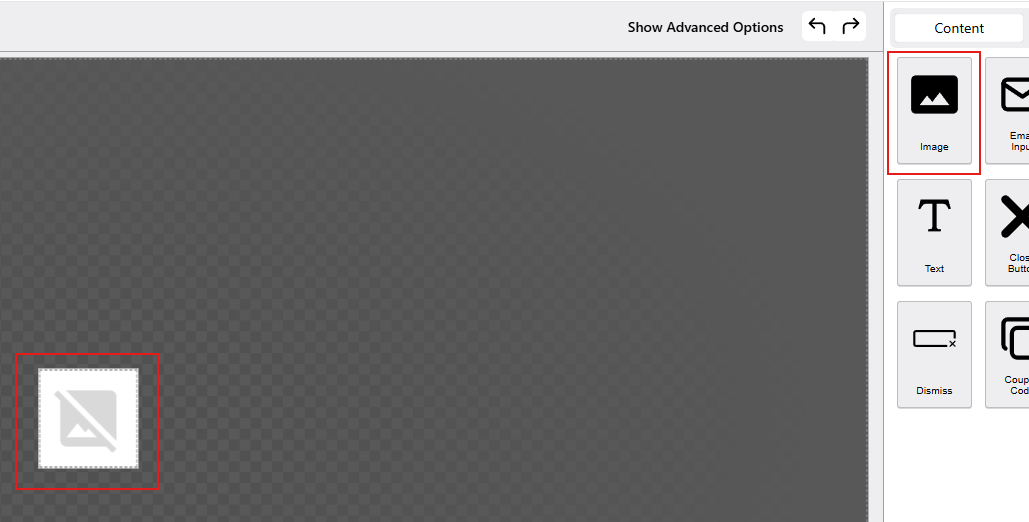
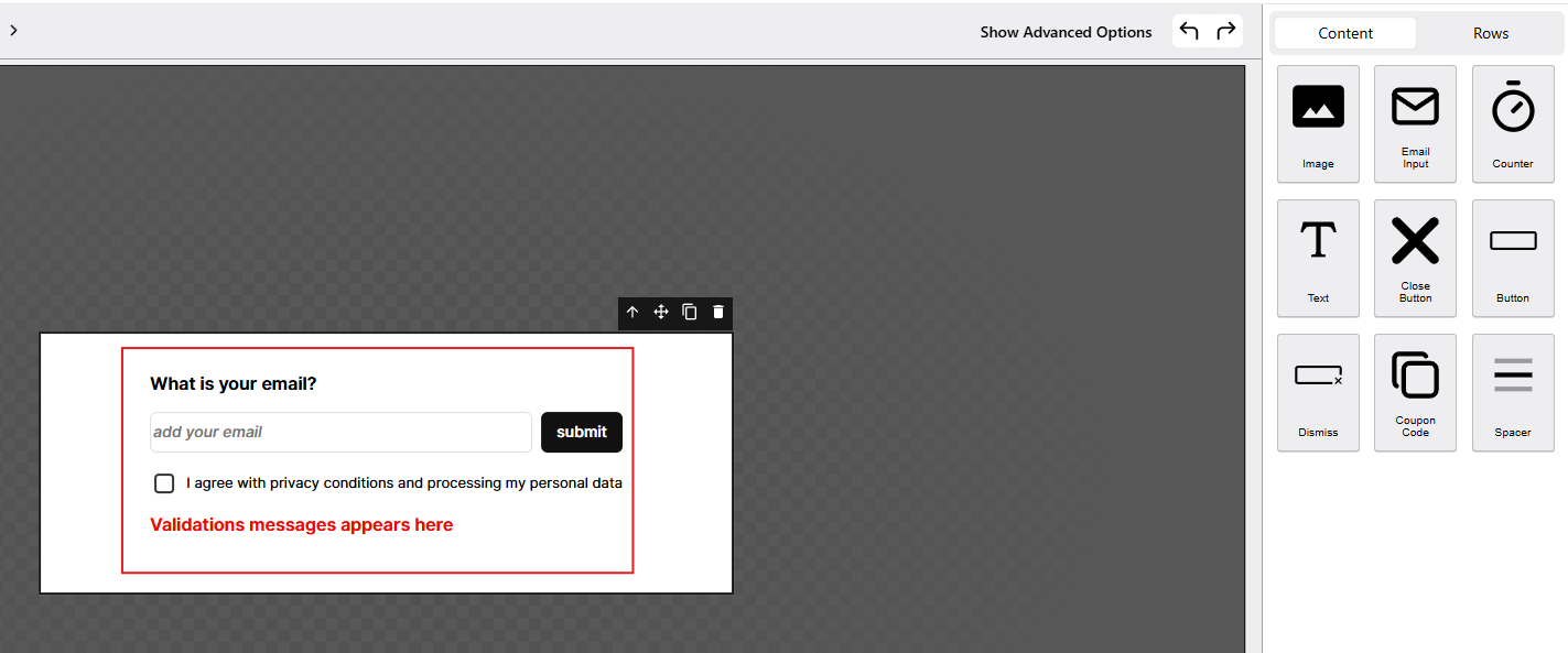
Image Email Input
A field where visitors can enter their email address. This is useful for collecting subscribers, leads, or participants for promotions.
Email Input Counter
Displays a countdown timer to create urgency. Commonly used in limited-time offers or flash sales.


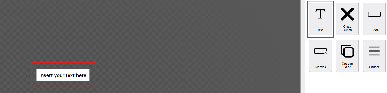
Text
Add headings, descriptions, or call-to-action messages. You can fully customize the font, color, and size to match your design.
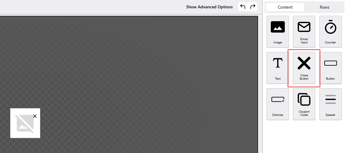
Text Close Button
Allows visitors to close or dismiss the popup. You can customize its style and placement for better user experience.
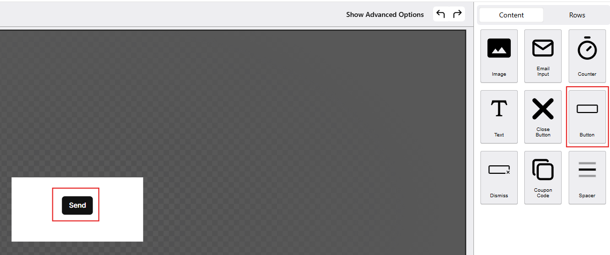
Close Button Button
A clickable button that can lead users to a specific page, submit a form, or trigger an action. You can edit the label and link it to your preferred URL.
Button Dismiss Text
A simple text element (like “No, thanks” or “Maybe later”) that acts as an alternative way to close or dismiss the popup.


Coupon Code
Displays a unique or static coupon code that customers can copy and use. Perfect for discount or promo campaigns.

Spacer
Adds space between elements to improve layout and visual balance. Useful for organizing content neatly.

Advanced Options
When you click Show Advanced Options, the HTML editor for the selected content will appear, and an Advanced tab and Edit Html will appear.

This allows you to:
- Edit the element’s HTML directly.

- Access more settings like custom styles or classes.
- Make detailed adjustments beyond the basic options.
You can switch back anytime to the basic editor if you prefer the visual view.
Sticker PopUp Canvas
This is the design area for the Sticker popup. You can drag and drop elements (like text, images, or form fields) from the right panel into this space to build your sticker-style popup.

Steps
This represents the current step in a multi-step popup flow. Clicking on it likely allows you to manage or switch between steps (e.g., Step 1, 2 and 3 ).

Element Toolbar Icons
This toolbar appears when you select an element in the PowerPop Editor. It allows you to quickly manage and adjust elements.
- Move Up – Moves the selected element one level higher in the layout.
- Move / Drag – Click and drag to reposition the element within the popup.
- Duplicate – Creates an identical copy of the selected element.
- Delete – Removes the element from the popup.
- Settings – Opens the element’s settings panel to edit content, style, or advanced options.

The PowerPop Editor is a complete, user-friendly tool designed to help you build, customize, and manage popups visually. With its drag-and-drop interface, responsive previews, and advanced editing options, it gives you full creative control over how your popup looks and behaves.
From selecting templates and arranging layout rows to fine-tuning styles and behaviors, every feature in the Editor is built to make the popup creation process simple, efficient, and flexible. Whether you’re designing a newsletter signup form, discount offer, or multi-step promotion, the PowerPop Editor provides all the tools you need to create engaging, conversion-driven popups that match your brand’s style and goals.
What’s Next
Learn how to adjust your popup’s layout, design, and behavior in detail in the next guide: