Editor Settings - Decorations
The Decorations lets you enhance the visual appearance of any element in your popup. It provides full control over styling—allowing you to customize backgrounds, borders, shadows, gradients, and more. With these settings, you can make your designs stand out and match your brand’s look and feel.

Edit Hover Style
Within the Decorations section, the Edit Hover Style option lets you define how these decorative elements should behave when a user hovers over the text. You can adjust effects like underline appearance, color changes, or added emphasis on hover.
This feature is useful for making interactive elements stand out, improving user engagement, and guiding attention to key actions.

Background Color

Select a background color for the element. Choose none for a transparent background or pick a custom color from the color picker.
Border Radius

Round the corners of your element by setting values for:
- Top Left
- Top Right
- Bottom Right
- Bottom Left
You can input a numeric value and choose the unit (e.g., px, %, em).
Border

Customize the border style around the component:
- Width – Define the border thickness.
- Style – Select a style such as solid, dashed, or dotted.
- Color – Pick a color for the border.
Box Shadow

Add depth or highlight an element by applying a shadow effect. Click + to open detailed options like shadow offset, blur, and color.
Background
You can add a background layer to your component by clicking the + icon.
This section allows you to apply an image or pattern and control its behavior.
Options available:
- Image – Upload or select an image to use as the background.

- Repeat – Determine how the image repeats:

- repeat-x – Repeats horizontally
- repeat-y – Repeats vertically
- no-repeat – Displays the image once
- Position – Sets the image placement within the element:

- left top, left center, left bottom
- right top, right center, right bottom
- center top, center center, center bottom
- Attachment – Controls how the image moves when scrolling:

- scroll – Moves with the page
- fixed – Stays in place while scrolling
- local – Scrolls with the element’s content
- Size – Adjusts how the background image scales:

- auto – Keeps the image’s original size
- cover – Scales the image to cover the entire area
- contain – Fits the image within the element while maintaining proportions
You can add multiple background layers by clicking + again.
Opacity

Adjust the transparency of your element using the slider. A lower value makes the element more transparent, while 100% keeps it fully opaque.
Transition
The Transition setting allows you to control how visual changes occur when an element’s style is updated (for example, when hovering or animating). Click + to add a new transition.
Options available:
- Property – Choose which property to animate:

- width
- height
- background-color
- transform
- box-shadow
- opacity
- Duration – Set how long the transition lasts. You can use:

- s (seconds)
- ms (milliseconds)
- Timing – Choose how the transition progresses over time:

- linear – Constant speed
- ease – Starts slow, speeds up, then slows again
- ease-in – Starts slow and speeds up
- ease-out – Starts fast and slows down
- ease-in-out – Starts and ends slow, with a faster middle phase
You can add multiple transitions for different properties by clicking + again.
Transform
The Transform setting lets you apply 2D or 3D transformations to your element—such as scaling, rotating, or shifting its position. Click + to add a new transformation.
Options available:
- Type – Choose the type of transformation to apply:

- scaleX – Scales the element horizontally
- scaleY – Scales the element vertically
- scaleZ – Scales the element in 3D space
- rotateX – Rotates the element around the X-axis
- rotateY – Rotates the element around the Y-axis
- rotateZ – Rotates the element around the Z-axis
- translateX – Moves the element horizontally
- translateY – Moves the element vertically
- Transform Value – Defines the unit of measurement for rotation or scaling:

- deg – Degrees
- rad – Radians
- grad – Gradians
You can combine multiple transformations to create dynamic and engaging visual effects by clicking + again.
Cursor
Define how the mouse pointer behaves when hovering over the element. Common options include:
- auto
- pointer

Gradient Background
The Gradient Background option allows you to add smooth color transitions to your element’s background. Click + to create and customize a gradient layer.
Options available:
- Color Adjust – Define the colors and their positions to control how the gradient blends across the element.
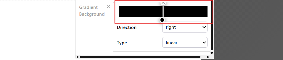
- Direction – Choose the direction of the gradient:

- right
- bottom
- left
- top
- Type – Select the gradient style:

- linear – A straight color transition.
- radial – A circular or elliptical gradient from the center.
- repeating-linear – Repeats the linear gradient pattern.
- repeating-radial – Repeats the radial gradient pattern
The Decorations section gives you creative control over your popup’s visual design. By combining colors, borders, shadows, and gradients, you can create visually appealing layouts that capture attention and improve the overall user experience.
Learn how to further refine your design by customizing Image Settings — explore how to adjust image size, positioning, and behavior within your popup: Editor - Image Settings